
Unsolicited Rebrand: The Cologne Cathedral
Modern branding guidelines and marketing materials,
infused with centuries of Gothic elegance
As a 19-year-old stepping into the Milan cathedral on a chilly November morning, I was struck with awe. I was smaller than a child… I was an ant. The arches soared around me, and the shadowy ceiling above was barely visible. The stained glass windows were muted from the heavy clouds outside, and rows of tiny votive candles flickered along every wall. The combination of elegance, solemnity, grandeur, and devotion was overwhelmingly beautiful. I never forgot that feeling.
Eight years later, I needed to pick a UNESCO World Heritage Site as the basis for a semester-long Design Synthesis project. We were asked to design a logo and style guide for our site, then create an entire suite of materials: stationery, business cards, site signs in 7 languages, brochures, a website, an app button, and merchandise. I was thrilled with all the different directions I could take this assignment, but remembering the pure awe I felt in the Milan Cathedral, I eventually decided to design materials for Germany’s massive gothic Cologne Cathedral.


Logo Design and Branding
Despite my initial intimidation, I found the process of logo design to be very fun. I pulled out a huge sheet of newsprint and started drawing ideas based on photos I had collected, looking for forms that were both simple and elegant.
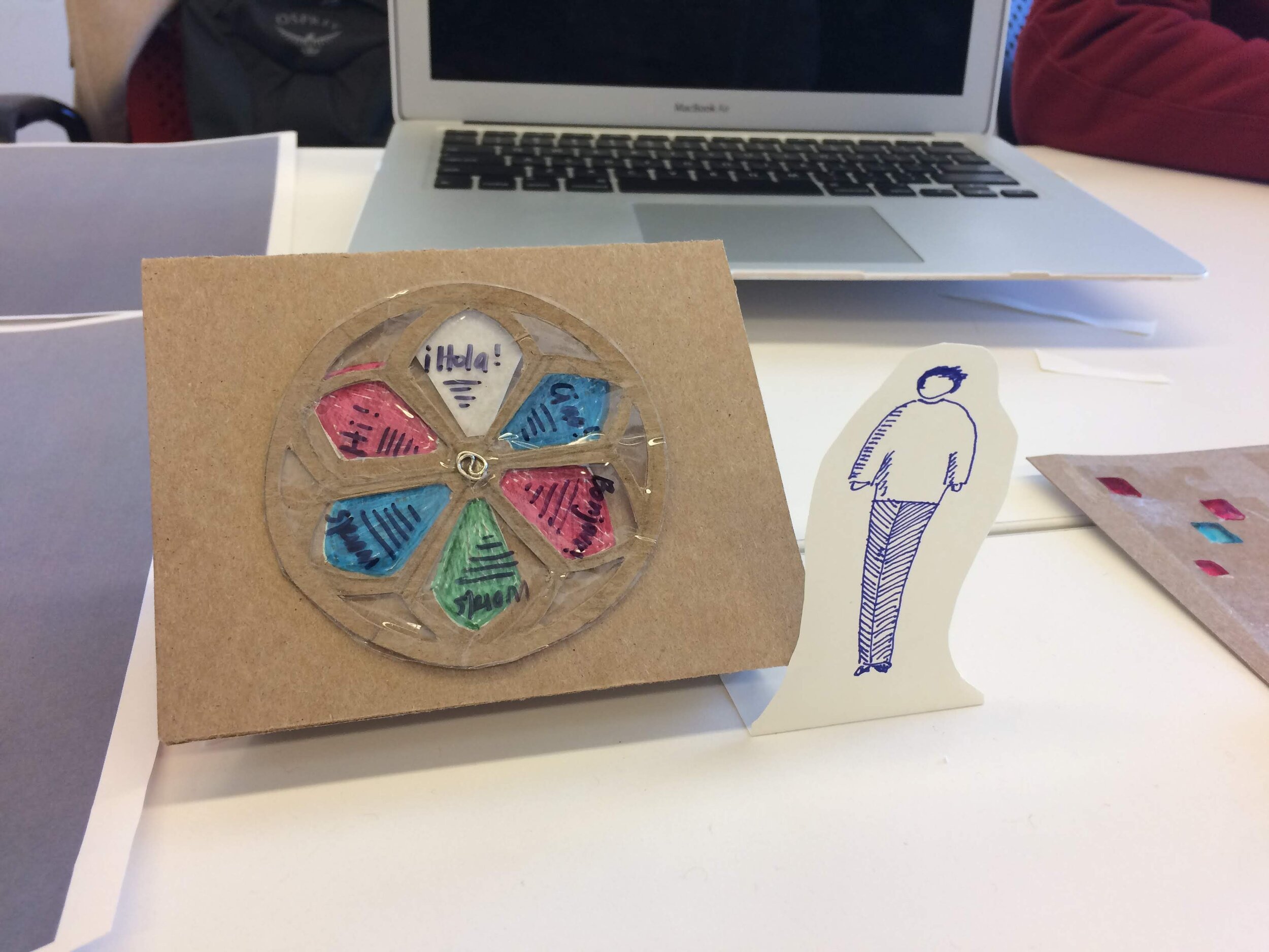
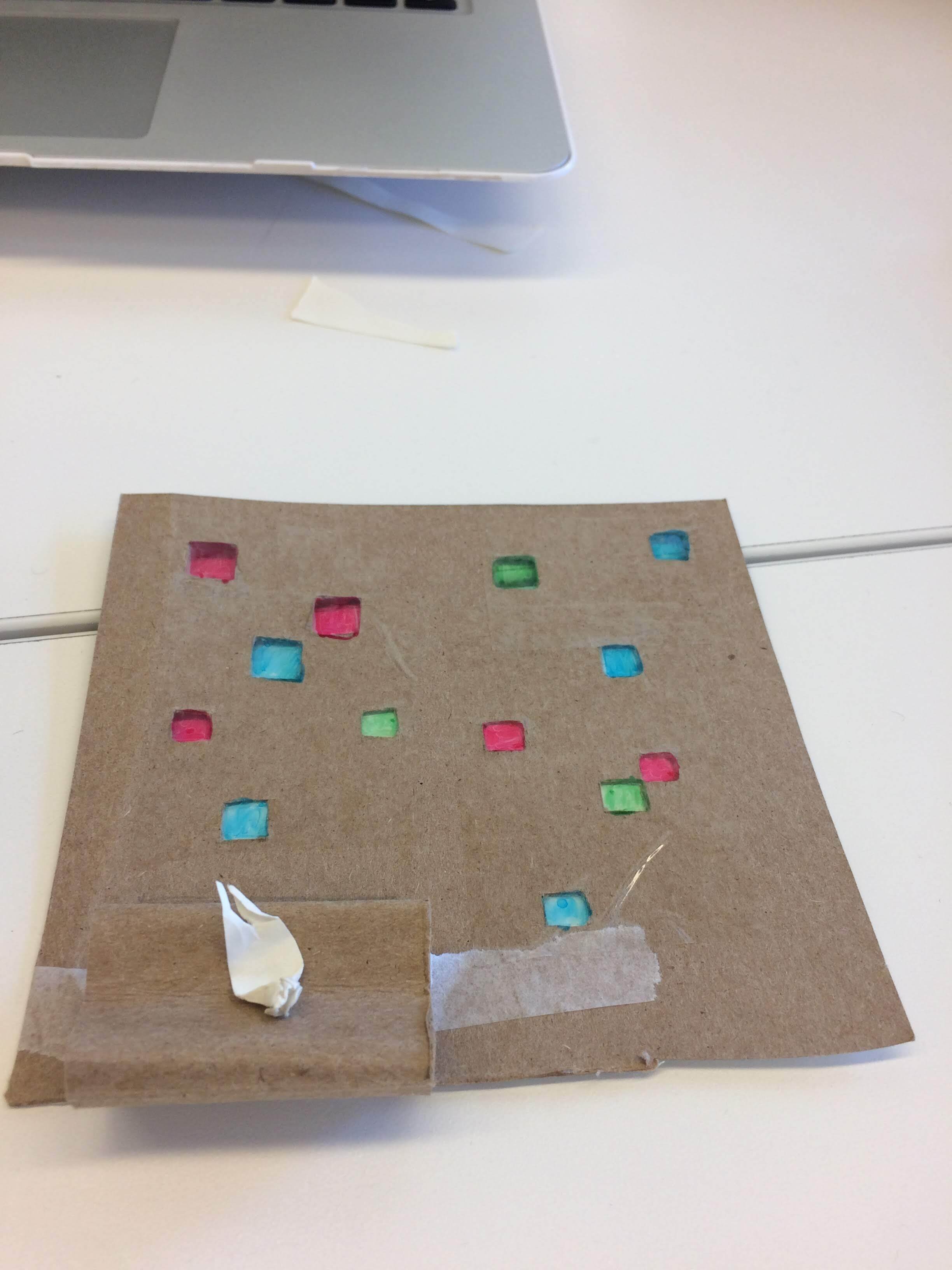
The final logo is inspired by arches within the famous Cologne pixel window. I stumbled upon the idea while “procrastinating”, picking up a new hobby of linocut carving. When I confessed as much to my professor, he told me that working with my hands and experimenting with different mediums was a valuable creative strategy. It’s true that actually having to carve my design out physically made me realize several areas that could be simplified for the final logo.
I chose the font Alegreya Sans for my materials, because it has a subtle gothic angularity about it, despite being crisp, modern, and easy to read. The color palette features buttery dove-grey shades inspired by the cathedral’s stone, and three rich shades of teal.


Other materials
A good style guide is like the thesis of a paper: once you’ve solidified it, everything else is much easier. I had so much fun experimenting with the various materials required for this project. My favorite elements of this suite were the New Yorker exhibit advertisements, creating realistic mock-ups of a tourist t-shirt and pixel stained glass earrings, and mocking up a 3d site sign with modern arches and information in 7 different languages.


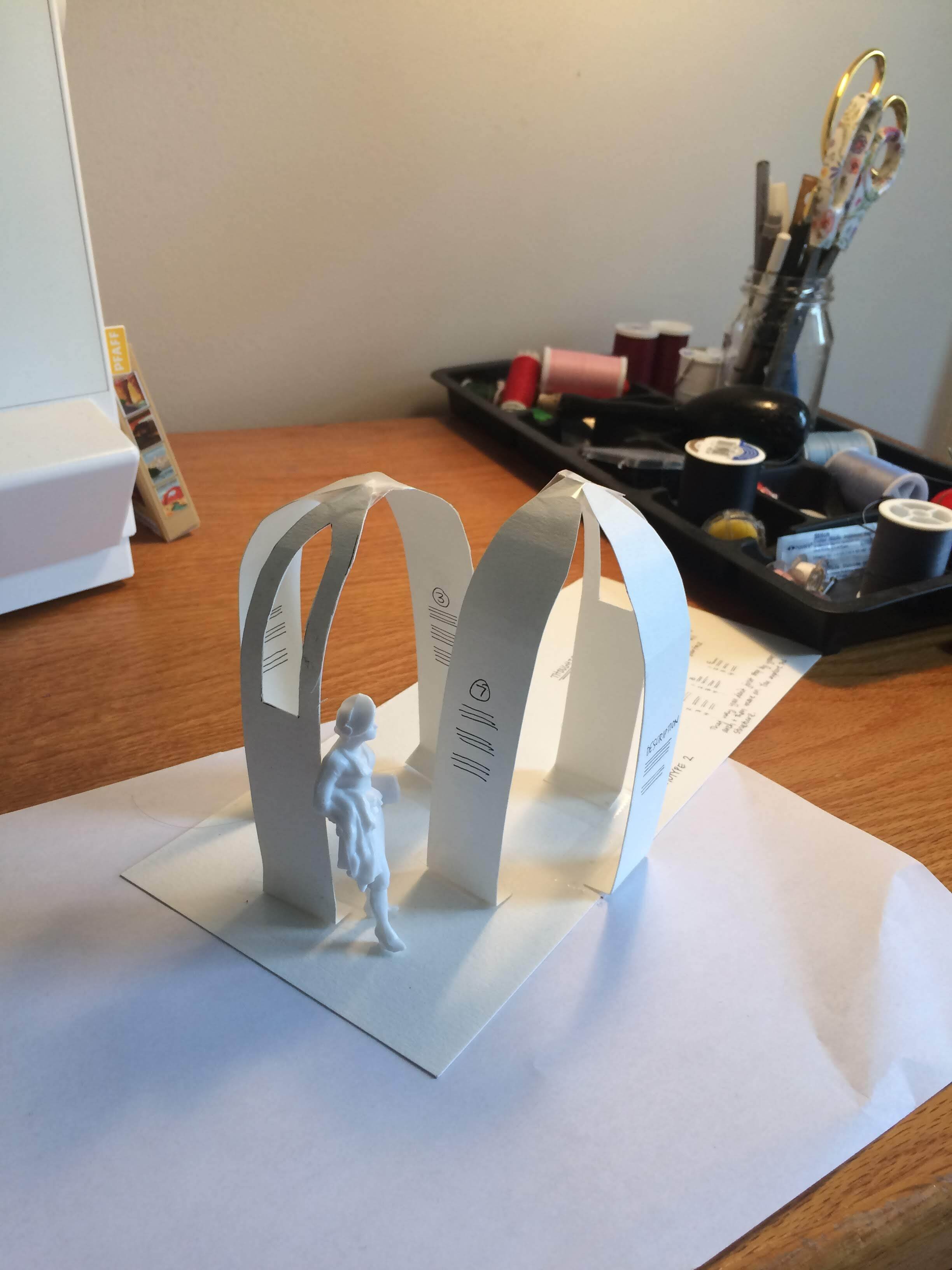
A note on the site sign
Initial ideas for the site sign were based on the cathedral’s famous stained glass. However, walking by the Boston Public Library one afternoon I happened upon an organic, beautiful little memorial to social activist Kip Tiernan which reshaped my ideas for this project. My final design uses flat steel arches with text engraved at a pedestrian’s eye-level. The arches mimic the elegant geometry of the Cologne Cathedral arches, while the two bases suggest the iconic twin towers of the cathedral. The steel makes the installation durable, and helps give it a sleek, understated look that does not distract from the cathedral itself.


A final poster exhibiting all of the elements together.
Learnings

“Nobody said it was easy.
No one ever said it would be this hard.”
- Coldplay, and also me mid-semester.
Pick projects that spark lots of little ideas in your brain. Before picking the Cologne Cathedral, I was captivated with the idea of doing something ancient and norse, just so that I could design with runes. However, I realized that I didn’t have any other ideas about the site… just runes. The Cologne Cathedral had so many elements that sparked my imagination and popped up throughout the duration of the months-long long project. Those little ideas formed a strong ecosystem, which resulted in a richer and more cohesive design outcome.
Fine tune the important things. Make sure your foundational elements (logo, colors, typography) are solid and work in a lot of different situations. It’s good to plan for tricky circumstances and address those design concerns early, rather than being surprised later in the project when you can’t change as much.
Immerse yourself and draw inspiration from a wide variety of sources. I watched documentaries, read blogs, downloaded walking tours, listened to medieval choir music, and sketched stained-glass windows during class. For months I was Cologne Cathedral NERD, and that enthusiasm and knowledge infused itself deep into my design work.