
Venezuela: Land of Grace
(+ An ode to great design professors)
The first time I felt like a real designer was when Douglass Scott took a pair of scissors to my project.
Doug, a veteran designer and former Creative Director for WGBH, knew a thing or two about whipping new designers into shape. Studio I began at 8am sharp, and woe unto to the student who hurried in at 8:07 holding a latte. Doug taught us about the Universal Law of Printer Malfunctions, and how you should never, ever (ever) print the morning something is due. We tried anyway, and were appropriately chastised when we showed up to class empty-handed and sheepish.
During our critiques, Doug would wield a red Crayola marker with deadly efficiency, striking entire sections from our lovingly-crafted design layouts. Those who showed especially bad design judgement received his signature “skull and crossbones” scrawled across the offending section. He clipped up our work and rearranged it to show us alternate layouts. Our mockups and drafts were not sacred to him.
This tough love feedback transformed me from an artist to a designer. I learned to accept (and later welcome) feedback, to face design challenges head-on, and to take real pleasure in re-assessing and improving my work.
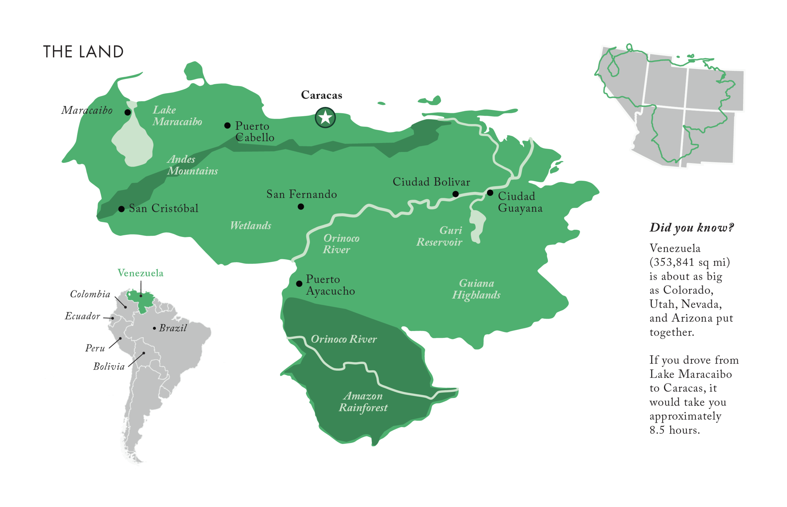
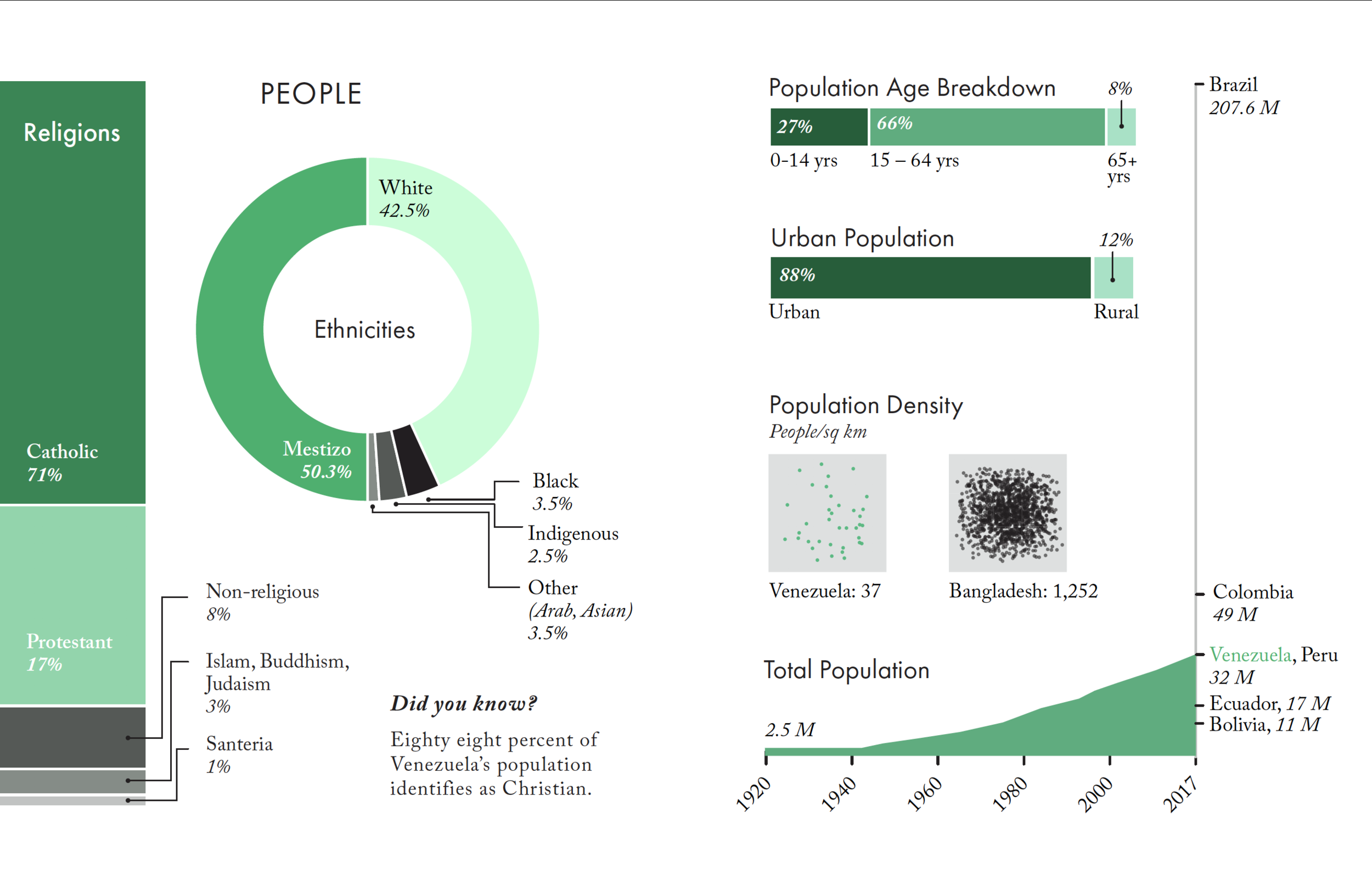
For our final project in Studio I, we were randomly assigned a country, and given a checklist of around 30 facts, comparisons, and statistics to visualize. We could represent this on a 24 x 30 poster, or in an accordion booklet. I was the only designer in class who chose to try the accordion book. I was pleased with the results!
All the information we were required to incorporate into the final design layout.

A mid-stage mockup of the accordion booklet.
Selected page spreads:
topical addition: Visualizing a Crisis
Because Venezuela was experiencing an economic crisis at the time of this project, I felt this booklet needed to dedicate space to that issue. I chose to go beyond the required information checklist for this project and use visualizations to educate readers on the everyday implications of hyperinflation, and what that meant for Venezuelan citizens.


Flip through the entire booklet below:
A Final Bit of Polish
When I finished the booklet, I noticed that all the folded pages tended to make the book spring open. This looked unprofessional and made it more likely the book would get damaged in my backpack, so I spent an hour or so designing a matching sleeve to protect to booklet. I modified a template for a DIY CD case, and made the background black rather than green to lend some sleekness, and contrast it with the actual booklet.

Learnings:
Good designers embrace critique and are willing to make changes. Be grateful for feedback, and don’t take suggestions personally.
Never print in the morning before an 8am deadline. You will tempt the fates, and there is a 90% chance this will backfire on you.
Pay attention to political/economic/social context when planning your visualizations. Be aware of current events surrounding your topic, and acknowledge or highlight those in your work to make it more relevant.
Try something new. I had never designed a book before, and the accordion booklet was a good opportunity to learn new skills while creating something that stood out from the crowd.