
national park-ish poster
A chance to use some wacky colors and celebrate nature
I’m a sucker for those vintage WPA National Parks posters.
When I got asked to create a promotional poster/social media graphic for the upcoming church campout, I used it as a fun opportunity to try designing in a new style.
In the past, I’ve approached invitation design by letting the text take center stage. But looking at the WPA National Parks posters, I noticed that the designers draw your attention in using bold colors and strong illustration BEFORE giving you information about the park.
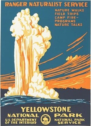
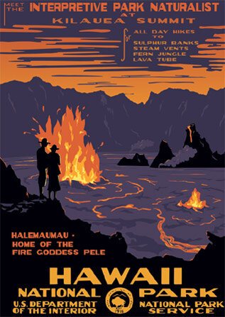
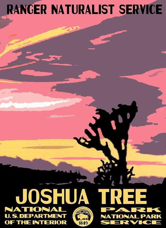
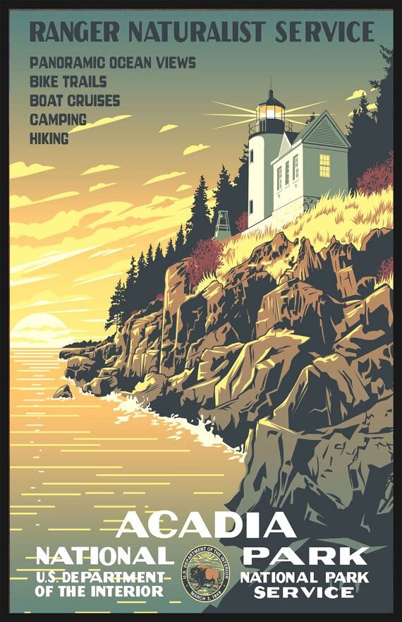
So for this project, I focused on the illustration and used the text as a secondary tool to support the feeling that it created. I did the illustration on my iPad Pro using an Apple Pencil and the app Procreate.
I finished the poster using Adobe Indesign to add typography. I used a Retro Glamping package from Typekit for inspiration, and ended up working with 3 fonts: Henriette Black for the title, HWT Artz for emphasized words, and FenwayParkJF for the italics. I used Adobe Illustrator to create the center seal, then imported the PNG to Indesign.
The end result was a fun departure from my usual style, and an ode to both WPA designers and my beloved National Parks. Related: Amber Shared’s hilarious national parks travel posters based on 1-star visitor reviews.