graphics for nature biotech
Visualizing business outcomes of university-funded biotech startups
In May 2019, I was approached by three strategy professors from the Marriott School of Management at BYU to consult on data visualization for an upcoming publication. They were conducting research about the outcomes and success factors of university-funded life-science startups, and had gathered a huge amount of data. What began as a quick feedback session turned into close four-month collaboration.
As we began, the team presented me with a slide deck of research findings, summarized in rough tables and charts. We then worked together to find creative, honest, and impactful ways of visualizing the data for an academic audience.


Mockups
I produced mockups in Paper 53 and Procreate on my iPad, based on weekly conversations with the research team. Pros and Cons for each visualization allowed me to give my collaborators a glimpse into my decision-making process, and so I didn’t have to spend as much time in our in-person meetings explaining my decisions. Rather, we could move quickly and make choices on the design considerations at hand.


Once we agreed on a general direction, I shifted to Illustrator to mock up options. Many of these mockups were changed or scrapped during the design process, but they provided a solid foundation for the graphics that eventually emerged.

This ended up becoming the bubble chart at the end of the article, but helped me visualize percentages and outcomes.
Publication challenge: Designing for Accessibility
Once complete, we shared a draft of the article with graphics with the editors and designers at Nature Biotech. They were pleased with the graphics, but noted that they had not been optimized for colorblind readers. This was a valuable wake-up call about designing for accessibility. I challenged myself to shift my thinking to not consider this an inconvenience, but rather an opportunity to improve the overall design. I considered the color-blind safe options from ColorBrewer, and checked my graphics with a colorblind simulator to make sure colors were distinct and contrasted well.
The blue and orange design scheme ended up looking more professional and polished than the original red and green scheme. It was a good reminder that humility and willingness to change can ultimately improve the quality of my work.
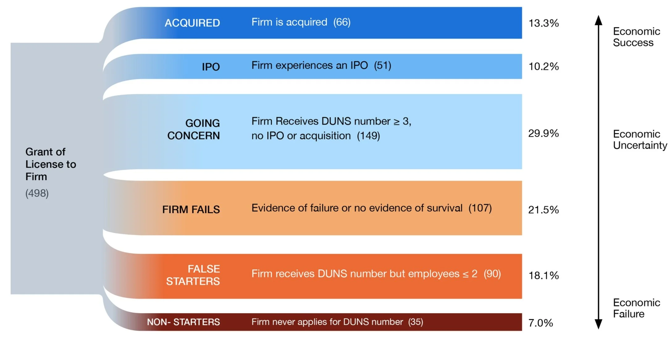
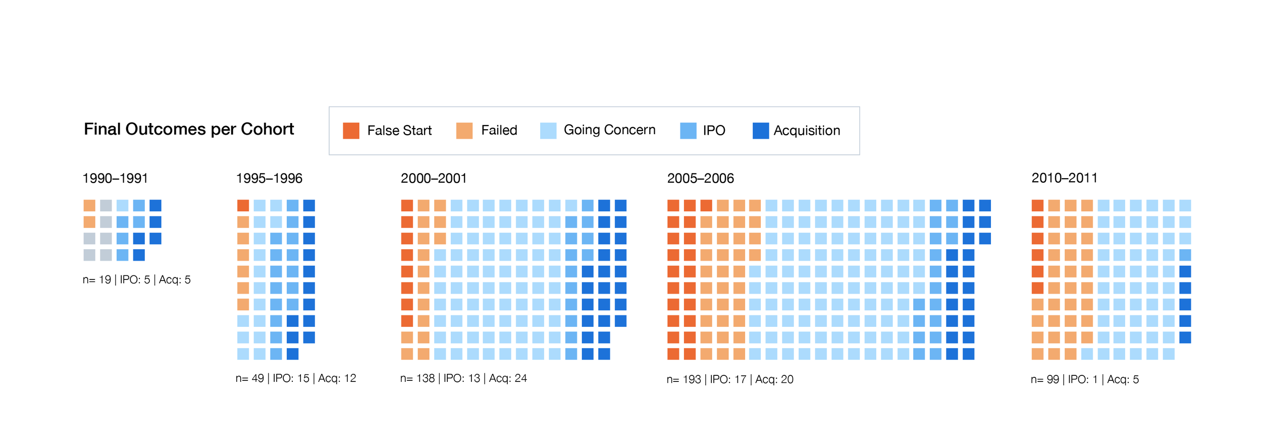
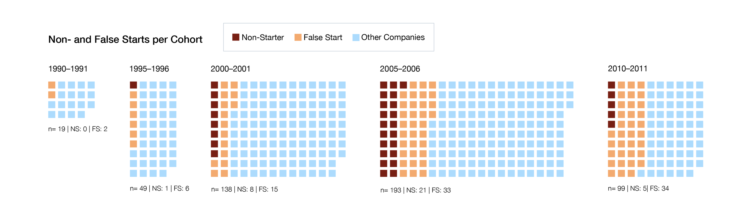
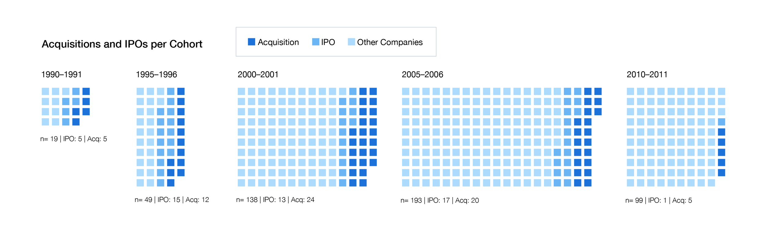
Final Graphics
The final graphics were published with the article in Nature Biotech, January 2020. While the article is behind a paywall, you can see low-res versions of the graphics by clicking the “Figures” tab on the right. Glorious high-resolution versions are below.


Learnings
Speak up if you’re confused. Your teammates will not think you are dumb for asking questions. They will appreciate your efforts to understand. Your inexperience with a topic can even be a superpower: position yourself as an intelligent audience member who is not familiar with the project. This can help you spot gaps in the information your research team is sharing, and craft an engaging, intuitive learning experience for your intended audiences.
Know what you know. This was my first time working as a data visualization consultant, and I suddenly had older, tenured, male professors looking to me as an expert. I learned to challenge ideas, make the case for my design choices, and make executive decisions where appropriate. As a younger woman working on a team of older men, I was grateful to find that they were empowering, respectful, and fun collaborators open to learning new things.
Meet in person when possible. The bulk of this project was conducted remotely, but I got a chance to meet with lead researcher Paul Godfrey and his wife when they were in Boston for a conference. Our working relationship was strong before, but chatting about life over French toast really deepened our level of trust and goodwill.